
Brand Collateral
Elegance Rate Card 2025
The full published price list, designed as a wall document — eighteen line items…

Three tiers, eight comparison rows, and red crosses used honestly — showing what each package does not include.
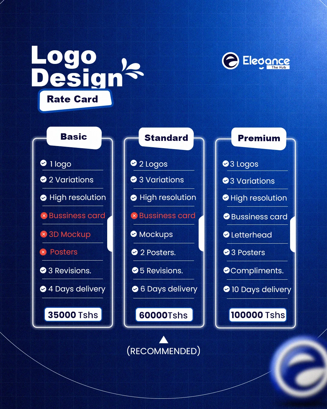
Pricing tables live or die on scannability. Three glowing outlined cards sit on a blueprint grid, each with a tilted white tab for the tier name — the tilt is the only informal gesture in an otherwise rigid layout, and it stops the table reading as a spreadsheet.
Every row aligns horizontally across all three cards so the eye can sweep left to right and compare a single feature. Excluded items are shown in red with a cross rather than omitted, which is the honest move: a client comparing tiers wants to know what they are giving up, not guess at it.
Standard carries the RECOMMENDED arrow. It is priced and specified to be the obvious choice, and the layout says so without a starburst.
Make three tiers comparable at a glance and be honest about exclusions without making the cheap tier look worthless.
Strict horizontal row alignment across cards, red crosses for exclusions, and one recommended tier marked with a single arrow.
The full published price list, designed as a wall document — eighteen line items…

Real WhatsApp threads, screenshotted and staged — Swahili and English, unedited…

A presentation-ready mockup plate: the mascot in tailored navy, leaning on a blank…
Bring the work. Tell us the business, the audience and the deadline — you will have a fixed price and a delivery date back the same day.
